Content Slideshow widget
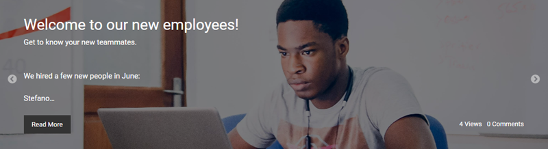
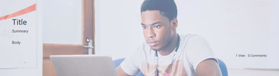
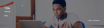
Use the Content Slideshow widget to highlight recent content from a selected blog, calendar, or forum channel. The slideshow presents a set number of posts sequentially for a set amount of time in an order based on recency. The displayed content is configurable and can include the contents title, summary, body content, and first image. Users can go to the displayed content by selecting the title, or by selecting the Read More button (if enabled).
Multiple Slideshow widgets can be used on a single page or space, each displaying content from different sources in your workplace. For instance, you may have a Slideshow widget displaying recent entries from your CEO’s blog, and another Slideshow widget displaying current discussions in your workplace’s forum. A single Slideshow widget cannot itself collect and display information from multiple sources.
Sections in this article:
Access and content visibility
This widget displays content from a connected channel. However, users will only see content that they have at least Read access to
Image sizing and scaling
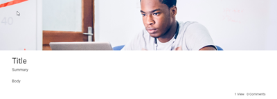
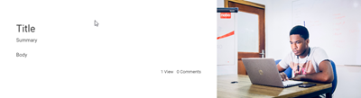
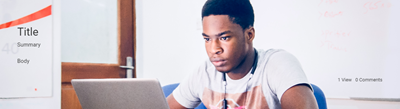
See Slideshow Content widget: Recommended image sizes
Set up
- Place a
 Content Slideshow widget on a page, space, or dashboard. For more information, see Placing and setting up a widget.
 - Select the placed widget's Edit button.
- Review and make changes to the settings on the Options, Layout, and Appearance tabs. You can find details about the widget's settings in the Settings section below.
- In the widget editor, select Update to apply your changes or Cancel to discard them.
- At the bottom of your page, space, or dashboard, select Publish or Save as Draft to save your changes.
Settings
| Setting | Description |
|---|---|
| Title | Enter a title for the widget. The title appears as a heading above the widget's contents. You should use the title to provide context to the widget and better structure a page's content by clearly denoting different sections. When entering a title, you do so only for your currently selected language. If your digital workplace supports multiple languages, you should select  Translation and enter a title for each supported language. Translation and enter a title for each supported language. This field can contain a maximum of 140 characters. |
| Description | Enter a description for the widget. The description appears between the title and the widget's contents. You can use this text to provide information to users about the widget. When entering a description, you do so only for your currently selected language. If your digital workplace supports multiple languages, you should select |
| Channel Type | Select a channel type. The Channel setting will only contain channels of this type. Options include:
|
| Channel | Select which channel to display content from. You will only see channels that you have at least Read access to. When selecting a channel, you can filter the channel list by entering a channel's name into the provided search box. These filtered results will only display up to 100 matching channels. |
| Setting | Description |
|---|---|
| Slides | Select the number of slides to display. Options range between 1 to 20 slides. Each slide displays a unique blog article, calendar event, or forum topic from the connected channel. These slides are always ordered from most to least recent. Some additional behaviors to be aware of:
|
| Time | Select the display time for each slide. Options range between 3 to 20 seconds. The default value is 10 seconds. |
| Transition | Select a transition animation. Options include:
|
| Image | Select the position of a slide's image in relation to its text. Options include:
Slides always display the first image in a blog article, calendar event, or forum topic. |
| Overlay | This option is only available if the Image setting is set to Behind. Select an overlay style to apply to the image so that the text appearing above it is easier to read. Options include:
|
| Dots | Select to display navigation dots below the slideshow. Users can select these dots to go to a specific slide. The dot of the current slide appears darker than the other dots. |
| Arrows | Select to display navigation arrows on the left and right sides of the slideshow. Users can select these arrows to move to the previous (left arrow) or next slide (right arrow). |
| Title | Select how much of a content's title is shown on a slide. Options include:
|
| Summary | Select how much of a content's summary is shown on a slide. Options include:
|
| Body | Select how much of a content's body is shown on a slide. Options include:
|
| Read More | Select whether a Read More button displays on slides. When a user selects Read More they will go to the related article. Display options include:
|
| Rating | Select to display the rating of a blog article, calendar event, or forum topic. If the content has not been rated, no rating will display on the slide. As of January 26, 2023, users can no longer rate blog articles. As a result, ratings that occurred before this change will be displayed. |
| Comments | Select to display the number of comments on a blog article, calendar event, or forum topic. Users can select this to go to the comments section of the associated content. |
| Views | Select to display the number of views on a blog article, calendar event, or forum topic. |

Your digital workplace's theme overwrites many of the settings on the Appearance tab. However, the settings listed below are usable.
| Setting | Description |
|---|---|
| Class | Enter CSS class selectors to provide additional styling to the widget. For more information, see Applying custom CSS to widgets. |
| Height | Select the height of the widget. Options include:
|