What is it?
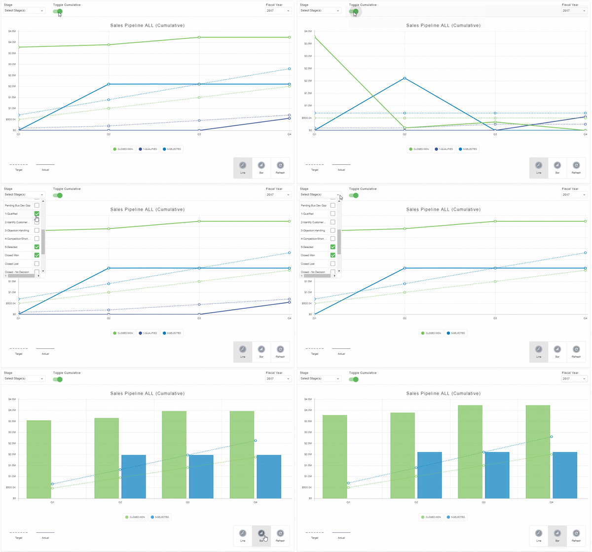
The Salesforce Pipeline Integrations widget provides a portal into your Salesforce environment which comparing your actual vs. target amounts for each stage in your opportunity pipeline.

Features and functionality
The Salesforce integration widgets provide many of the features available in the Salesforce web interface:
View Totals
You can view the values for the selected stages in your pipeline.
View Targets
You can view the targets for each stage of your pipeline and compare those targets with the actual values.
View by Line or Bar Graph
You can select whether to view the information in a line graph or bar graph format.

View cumulative or non-cumulative views
You can switch between viewing the graphs in cumulative and non-cumulative views.

Select Pipeline Stages
A dropdown is available to toggle which stages of your pipeline to include in the graph

Set Targets
If your Salesforce account has administrator privileges, you can set target values by quarter for each of the opportunity stages.
Limitations
- Only English language use is supported in the Salesforce Pipeline integration.
- Salesforce imposes API limits “per user per hour” which may result in some users unable to access this widget at certain times.
How to add a Salesforce Pipeline widget
Step 0: Enable CORS
Salesforce integration widgets require CORS to be enabled in your Salesforce instance. To enable CORS, see Salesforce - Enabling CORS.
Step 1: Add a widget
Add an Integrations widget to your page.
Step 2: Select Salesforce Pipeline
Edit the widget and select the Salesforce Pipeline option from the list.
Step 3: Enter your Salesforce instance URL
Enter the full URL for your Salesforce instance. Ex. https://na34.salesforce.com
Step 4: Select your instance type
Use the dropdown to select whether you are connecting to a production or sandbox instance of Salesforce.
Step 5: Configure advanced options (optional)
Selecting Advanced Options will expand a list of additional features. You can enable or disable them as appropriate.
- Default Chart Type - You can choose whether the chart should appear as a line or bar on load. The default is Line.
- Default Opportunity Stages To Show - You can enter a comma-separated list of opportunity stages to show when the widget loads. The default is Closed Won. You can toggle which are displayed in the stage selection dropdown on the widget after it loads, as well.
- Show Cumulative Data By Default - You can choose whether the graph will display cumulative data when it loads. This can be toggled manually after the widget loads, as well.
- Show Cumulative Toggle - You can remove the option to toggle between the cumulative and non-cumulative view on the graph
- Time Increment - You can select whether the chart divides information by Month or Quarter.
- Opportunity Type Filter - There is a dropdown that allows you to set the title of the chart based on the opportunity type you wish to display, The options are All, Upsell, Renewal Recurring, and Net New. The default setting in All.
- Opportunity Type Field Name - If you wish to only display opportunities of a specific type, you can enter the API name of the custom field to specify the field to filter against. This must be a picklist type field.
- Opportunity Types To Include - If you have included an Opportunity Type Field Name above, you can specify the values to include from that field.
- First and Second Custom Filter To Show - You can provide up to two custom filters to show by providing the API name of the custom field you wish to display. These will add additional dropdown menus to the published widget allowing you to actively filter the results based on the values of that field.


