Published
on
March 21, 2018
| 2,752 views
| 2 followers
members are following updates on this item.
 Last week we launched Workplace Analytics, a new analytics feature for your Igloo. It's powered by datafeeds, which were released late last year. Rather than providing a vast ocean of data to sift through however, it features some aggregated charts to answer quick questions you might have about community activity.
Workplace Analytics differentiates itself from your Google Analytics integration because it understands the shape of your digital workplace. It can separate information by content type, key on user identity, and gather information by Space directly. As ever, Workplace Analytics, Google Analytics, and datafeeds can work together in tandem to ensure you have answers to any questions about the activity in your community. Here are a few examples of easy answers in Workplace Analytics.
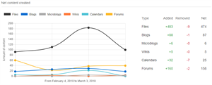
The Activity tab lets you see the creation rates for different kinds of content over several periods of time, from the last four weeks through to the last twelve months. The graph charts how many items of each content type were added over the data points, and the content types along the top can be selected to exclude them from the chart. Here's ours for the last month in Customer Care.
Workplace Analytics identifies three personas for members. Consumers, people who primarily view content in your Igloo; Contributors, who add likes, ratings, or comments to items; and Creators, people who create content or add files directly. The Leaderboard tab lets you see your front runners in each category, as well as an overall leaderboard with the most active members of your community.
With easy access to the top 20 contributors, creators, and consumers in your digital workplace, you can gain insight into people working to launch new areas, as well as who has the highest activity over time. The Leaderboard tab can display aggregate activity totals as well as totals for views, likes, comments, ratings, and article creation.
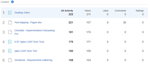
The Top Content tab offers three distinct views: an overview of the top content in your digital workplace, a look at high-performing channels, and a breakdown of activity by Space or Solution. Each display tracks the total activity, adding likes, views, comments and ratings together.
This view is invaluable for seeing what new announcements are generating engagement, and which Spaces and Solutions are seeing a lot of collaboration. Unlike Google Analytics, which focuses on monitoring traffic, Workplace Analytics lets you look at likes, comments, and ratings as well, giving you a window into the different ways your members interact with your content.
You can find additional information on Workplace Analytics in this recording of yesterday's webinar. If you have questions about the Igloo platform, workflows, or best practices, you can leave a comment here, or ask a question in the Community area.
3 Comments
Tammy Triplett -- definitely check this out! We got a preview of this when we were at Igloo and I was really impressed/geeked out.
Jim Tigwell Darren Jenkin Can you explain what the "Overall Member Activity" measures? We are trying to run an analytics report that shows how many users are logging into the digital workplace. I searched the Report Library, but did not find a Basic Report that allows us to measure Login Activity.
Hi Kerry,
Overall member activity measures the number of members who did anything in the site in the timespan, including view content. So if a user has at least one view, they're marked as active, because they've logged into the site. The site activity report can report on active and inactive members.